Overview
Here’s a project that didn’t go according to plan. No project goes to plan, of course. This was my first-ever project as design lead. I also acted as my own researcher by running concept validation studies and usability tests.
This project shows me at my best: enthusiastic and ambitious; creating opportunities to break down silos and build relationships; and ultimately delivering a pragmatic, feasible, user-centered design.
This project also shows one of my major early-career flubs: thinking in terms of pages, instead of tasks, experiences, and systems. I evolved in later roles.
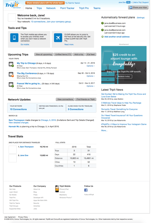
Before redesign 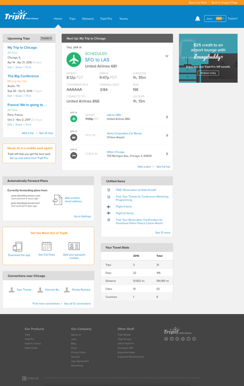
After redesign
Problem
Users struggled to perform basic tasks on the TripIt web app and mobile apps due to aging design and development infrastructure. The TripIt web app in particular lacked clear information architecture and visual hierarchy. The outdated design and lack of fully functional mobile web experience began to hurt TripIt’s brand credibility.
The TripIt team decided on the signed-in homepage as the first inroad toward updating TripIt’s look, feel, and function. Engineering wanted to convert the web app to Bootstrap to provide a mobile-friendly web experience.
Process
Using my own spin on a design sprint, I assembled a broadly cross-functional team from UX, Marketing Design, Brand, Engagement Marketing, Product Management, Engineering, and Customer Support. I led us in a two-week design sprint to create a shared vision of the TripIt web app that would serve our users well while meeting stakeholders’ goals. Afterward, I progressively refined the design and fleshed out interactions and content in partnership with my cross-functional partners. I gave a talk about my design sprint process at the Grace Hopper Celebration of Women in Computing in 2016.
TripIt’s product teams had a good understanding of users’ pain points, but we couldn’t agree which users and which problems were highest priority. I adapted TripIt’s existing personas to a worksheet format intended for use in workshops to drive alignment

Example persona worksheet, featuring me
In the first day of the design sprint, I used my persona worksheet in several exercises with cross-functional leadership. The exercises generated this shared mission statement for the redesign.
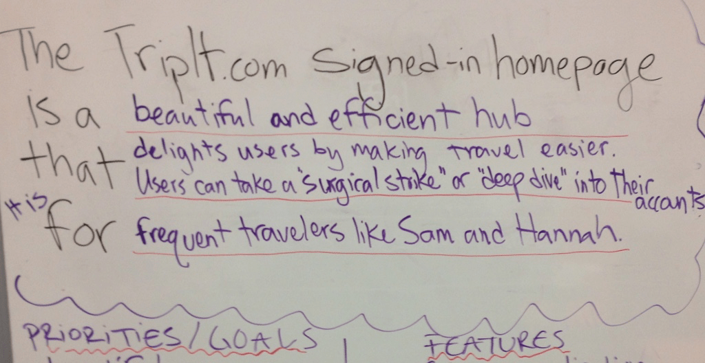
Redesign mission statement
Next, I ran some sketching workshops for the individual contributors whose work would be impacted by the redesign. We played a game that I call “Worst Experience Ever,” in which we storyboarded ways that TripIt could completely ruin a user’s life. Then we sketched ideas that could prevent those worst-case scenarios. I synthesized our favorite ideas into a series of paper prototypes that I tested internally.

Just two artifacts from my sketching workshops
I digitized the paper prototypes in Sketch, and I ran a concept evaluation study with users. We thought the right concept would win because it displayed more data. Users said they preferred the left concept because it was easier to scan, and felt more like the mobile app.

Two designs for concept evaluation
Solution
The redesigned signed-in homepage is fully responsive. It pares down content users found irrelevant and emphasizes the most important information to users: their trips. The “Next Up” module serves as a way for users to double-check plans in the booking phase, and quickly check in on the day’s events while they are traveling. This is particularly key for users with devices for which TripIt doesn’t offer a native app.
That sounds smooth. What went wrong?
This was my first project as design lead! So, you know, everything.
The biggest problem is design fragmentation. The TripIt team quickly redesigned, rebuilt, and released the signed-in homepage, Pro dashboard, and Trips page. Business priorities changed, and progress on the webapp stalled. When I left the company, we had only fully redesigned a small percentage of our web app. While the initial experience is an improvement, the overall experience is arguably worse. The design abruptly shifts multiple times in the middle of simple tasks. See for yourself by making a free account.
What advice would you give your past self?
Push back on the scope of the project. Don’t start with a single, isolated, high-traffic page. Instead, identify users’ top tasks. Target for redesign each of the pages that make up that flow. This increases the scope of the project, but it reduces the design fragmentation across a user’s experience of a product. Also, push to keep the redesigned pages in a beta experience until the bulk of our desktop-specific tasks are redesigned.
Also, please learn about accessibility and fix your color contrast. 😬
